Image-Left, Info-Right
The most popular email signature layout choice by far is the familiar image-left, info-right layout. This is the same layout you see on Facebook, Twitter and all Social networking sites with good reason — this layout helps the brain associate the image with the info beside it. It is usually a shorter design, and with enough unnecessary components removed, can be narrow as well making it optimized for viewing on a mobile device. The signature will still appear well designed if the recipient blocks images by default, and the subtle use of font-styling allows us to really emphasize the 3 most critical elements in a signature: Who you are, What you do, & Where you work.
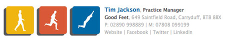
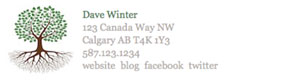


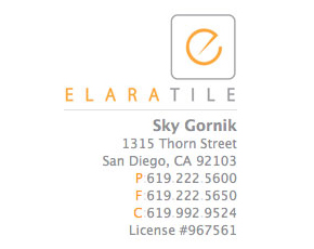
Image-Top, Info-Bottom
The next most popular email signature layout choice is the image-top, info-bottom layout. This layout can often look better for logos which are long and narrow. It is usually a slim-width design with a few lines beneath it. Because text on mobile devices and computers are almost always scrolled from top to bottom, this design allows you to fit much more information in is with additional lines. Because the image is on top, the signature will still appear well designed if the recipient blocks images by default. This design is perfect for the "kitchen-sink" signatures which have tons of info.


Long
Long signatures don't work for everybody, but can look great. Usually they are delineated by a line or two to help separate it from the rest of the email content. This type of signature is popular with people who are required by their workplace to insert legal text in thier emails.


Bordered
Top and bottom borders are sometimes applied to the image-left, info-right layout. This can help distinguish the signature from the rest of the message if the logo and signature is designed without much color.


Custom
Occasionally, we make a signature that doesn't really fit into the categories above. They may be only subtle variations off of an existing style or wildly different. While we can be creative here, we are still bound by the limitations of officially supported HTML email elements. If you select this signature style, be sure to tell us what's on your mind.